Problem
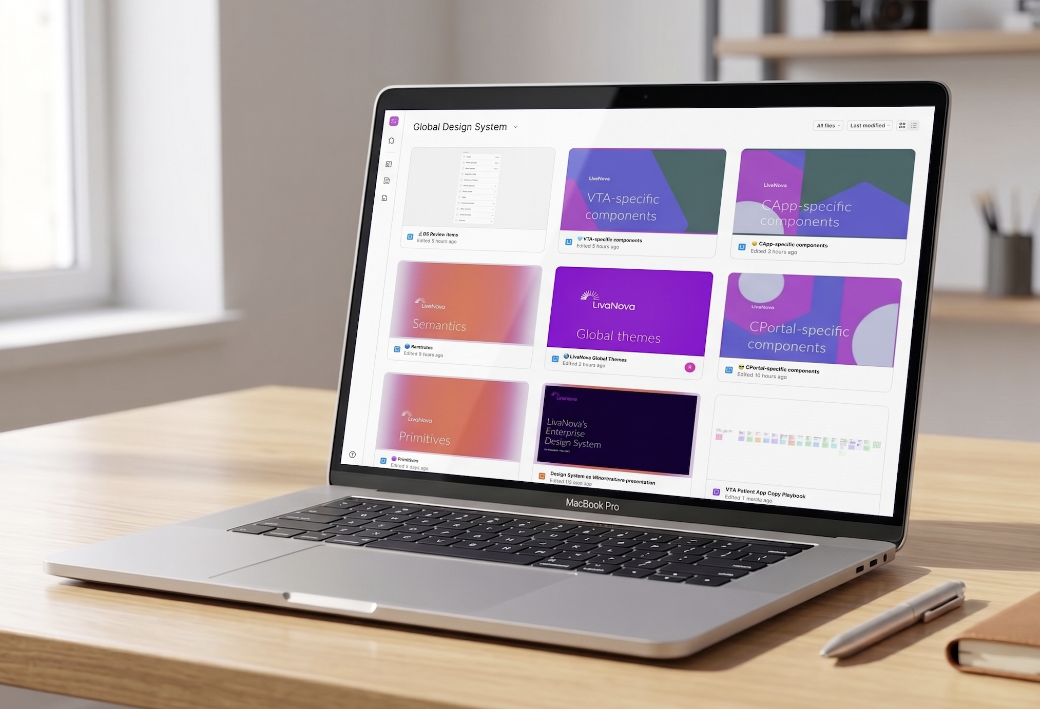
LivaNova was transitioning from a house-of-brands model to a unified, branded house identity, a shift that touched every layer of the product design system, from raw color values to component naming conventions. My role was to assist the team in a redesign of the system’s variables and tokens, migrate that architecture across every design file, and audit the component library so it held up under both human and AI driven workflows.
What started as a token and component refresh became something larger, a systematic effort to make the design system legible to the AI tools our development team had already started building into their process, Claude, Cursor, and Figma’s MCP integration, so that design intent could translate into production code with far less friction.
ROLE:
UI/UX Design System Engineer – discovery, user research, design, testing/validation
TEAM:
2 Design System Engineers, 4+ Senior developers from all three teams
TIMELINE:
6 Months for initial rollout
~ On-going efforts
BRANDING:
LivaNova is a medical technology company. It mainly designs, develops, manufactures, and markets medical devices and therapies for neurological and cardiac conditions. LivaNova’s major products include heart-lung machines, heater-coolers, oxygenators and perfusion tubing systems, autotransfusion systems, cannulae, devices for neuromodulation therapy for treating DRE and DTD, VNS therapy systems, and other related accessories.
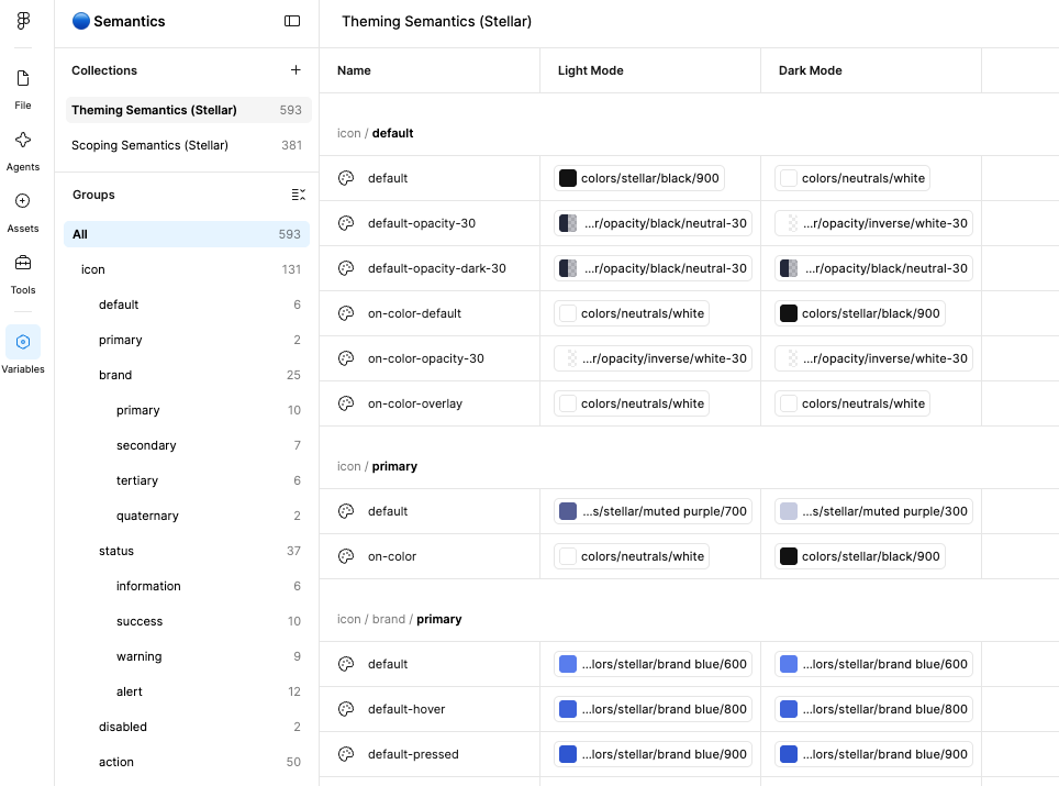
Moving from house of brands to branded house meant the existing token structure, built for multiple distinct sub-brands, no longer matched where the product was headed. Colors, spacing, and component styles that once served several visual identities needed to consolidate into one coherent, scalable system.
At the same time, we had begun experimenting with AI assisted workflows with development to speed up how design was translated into code. That created a second, less obvious requirement: the design system didn’t just need to make sense to designers, it needed to make sense to the tools reading it. If a token name, a character encoding, or a property type confused a human collaborator, there was a good chance it would confuse Claude too resulting in poor code and more tech debt downstream.
Rebuild the token and component foundation to reflect the new branded house direction.
Make that foundation legible to AI tooling, so design to code workflows could scale without constant manual correction.
The main goals were
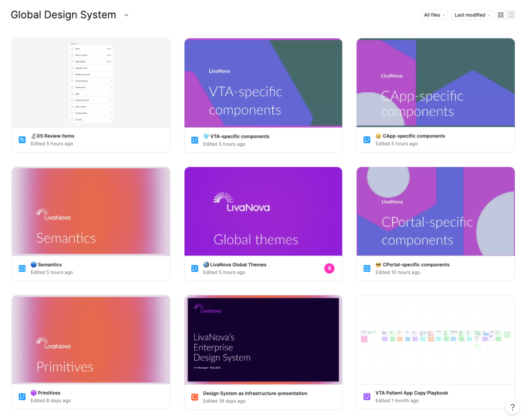
Rebuilding the token architecture with Figma’s extended collections
First there was an audit of the existing styles and variables, mapping what was redundant, what was brand specific and needed to be retired, and what needed to become a shared, semantic token. Using Figma’s extended collections, the token restructuring resulted in a smarter, more scalable hierarchy, one that could accommodate the new branded house direction without the sprawl of the old multi brand system.
Every naming decision, scales, token names, component names, property names, variant names, was made with the code stack in mind from the start, rather than translated after the fact. That meant working closely with development to understand their conventions before finalizing anything on the design side.
Once the new architecture was in place, I migrated the changes across all design files, updating a significant number of components to align with the new token structure.
Understanding how AI tools digest the system
Before assuming the new architecture would work well with AI assisted workflows, I tested it. I used Claude to explore how it interpreted the variables and tokens including the extended collection token sets documenting the results in a Storybook environment to compare against how development’s tooling was reading the same data.
This surfaced something concrete: certain tokens contained an unusual character that was disrupting how Claude parsed a large portion of the token set. It was a small, easy to miss detail that had an outsized effect. I brought the finding to development, and it turned out to be a problem on their side too a good example of how testing the system from the design side surfaced an issue that benefited the whole team, not just the AI workflow.
How we executed our goals
Building a design-to-code pipeline
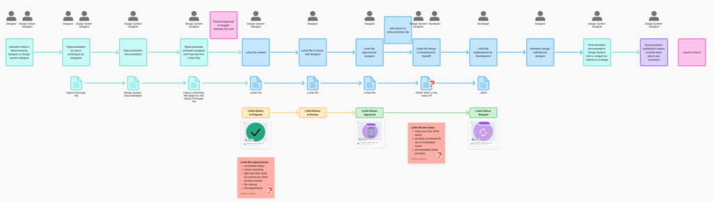
To validate the new system end to end, I built a working pipeline using Cursor with Claude, connected to Figma via MCP. This let me take tokens and variables directly from Figma and generate functional React components with styles aligned to Tailwind CSS, components that were then published to a local Storybook instance and pushed to GitHub for the rest of the team to reference.
This pipeline became the proving ground for every naming and structural decision in the system. If a component didn’t generate cleanly, that was a signal something upstream needed to change.
One of the clearest wins came from a simple comparison: a component feasibility question that previously took the development team a meaningful amount of back and forth to explore could now be answered directly through this workflow, cutting down exploratory dev time and giving designers a faster way to validate ideas before they ever reached a sprint.
End-to-end workflow
Figma → Claude/Cursor via MCP → React + Tailwind → Storybook → GitHub
Auditing for “agentic accessibility”
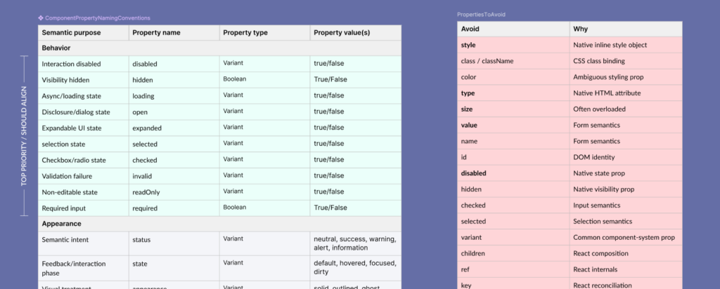
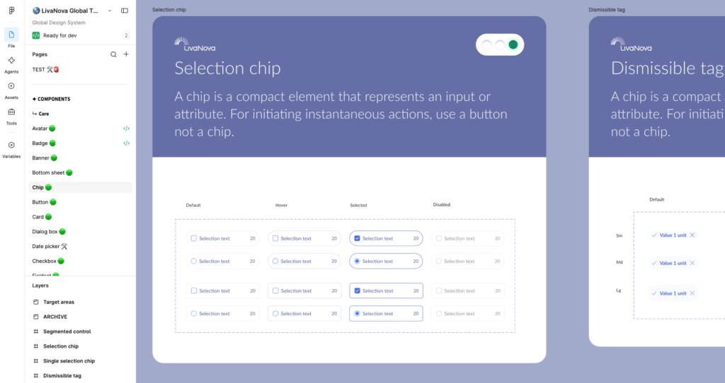
Beyond generating components successfully, I audited the entire component library specifically for what I started calling agentic accessibility, making sure the system’s structure aligned with code best practices at every level:
- Component naming and casing conventions
- Property naming and casing
- Property type selection (boolean vs. instance swap, etc.)
- Property value naming and casing
- Overall structural consistency between Figma and the codebase
I distilled the discovery sessions with development and the hands-on experiments from the Cursor/Claude pipeline into a defined set of rules, the criteria a component needed to meet to be considered code- and AI-ready.
Turning the rules into a tool
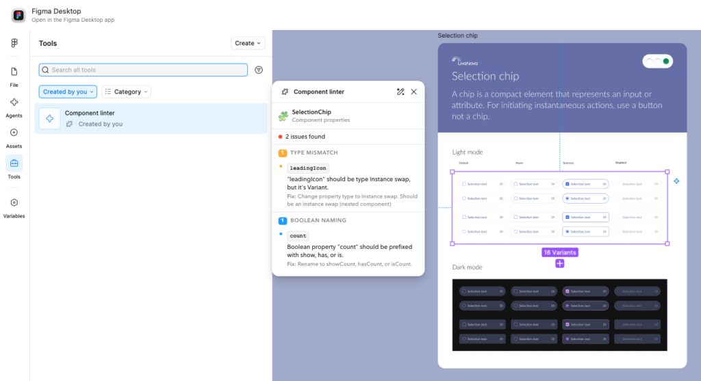
Rather than relying on manual review to enforce these standards, I built a component linter Figma plugin that scans individual components against the rule set we’d defined. It flags naming, casing, and structural issues automatically, catching problems before they ever reach development, turning what had been a discovery process into a repeatable quality gate.
Scaling the workflow across teams
Systems only create leverage if people actually use them. I hosted learning sessions to walk other designers through the new workflow, giving them hands-on time to experiment with the same tools and concepts, Figma’s extended collections, the Claude/Cursor pipeline, and the linter plugin.
I also worked directly with development to define what annotations mattered most for handoff, ensuring the system communicated the right level of detail without overloading files with noise.
Finally, we shared the full body of work, findings, tooling, and workflow, with both the broader design and development teams, to confirm the direction aligned with how each team actually worked, not just how we assumed they worked.
Outcomes
- A unified token architecture built on Figma’s extended collections, replacing a fragmented house of brands structure with a scalable, branded-house foundation.
- Design system governance was evolved and more process surrounding every aspect of the pipeline
- A validated design-to-code pipeline (Figma → Claude/Cursor via MCP → React/Tailwind → Storybook → GitHub) that turned design system components into functional code with minimal manual translation.
- A data-backed fix for a token encoding issue that was silently disrupting AI parsing identified through design side testing and confirmed as a shared problem with development.
- A defined standard for “agentic accessibility”, giving the team clear, testable criteria for what makes a component both human and AI legible.
- A custom Figma linter plugin that automates enforcement of those standards at the component level.
- Reduced development exploration time on component feasibility questions, replacing lengthy manual investigation with a faster, design validated process.
- Team-wide enablement through hands-on learning sessions, extending the workflow beyond a single designer to the broader design org.
- Design System updates channel allowing the us to inform the teams of the many various edits going on and newly published components.
Reflection 🤔
This project reinforced something I keep coming back to in systems work: a design system isn’t just a library of components, it’s a shared language, and every consumer of that language matters, human or otherwise. Treating Claude and Cursor as real “users” of the system, not just downstream tools, surfaced problems that traditional design QA would have missed entirely, like the character encoding issue buried in the tokens.
It also reframed how I think about naming and structure. Every decision, how a token is scaled, how a property is typed, how a variant is cased, is a decision about how well that decision will travel: to other designers, to developers, and increasingly, to the AI tools sitting between design and code. Getting that translation right at the foundation is what let this system scale efficiently across teams instead of requiring constant manual reconciliation.